Saber Life Foundation
Website Redesign - emphasis on accessibility
Saber Life Foundation - 2023
Project overview
NGO reached out to my team to fix some bugs on their homepage. Digging into the issues resulted in a complete site rebuild. Tim and I donated much of our time to this site in order to make it happen for the organization.
My Team:
Tim Burkart - web developer
My Role:
UX Designer
Tools used:
Figma, Google suite, Adobe suite, Wordpress
The Problem
Saber Life Foundation is a non-profit organization that thrives on community fundraising and public donations. During our initial investigation, we noticed the current layout of the website was causing frustration and confusion resulting in most users dropping off.
The Goal
If we can fix the bugs and optimize the site’s donation and application flow, then user retention will increase across the site.
Introduction & Research
At first, Tim and I were brought in to focus on the homepage. The client wanted the foundation to be eligible for Google Grants, but the site was very slow to load and had multiple structural issues.
After a discovery Zoom call and FigJam session with the client, Tim and I determined that we could donate our time assisting this foundation with a complete site redesign.
User Insights
Users reporting back that the current pop-up window for the application was visually scrambled, depending on which browser was being used
Pop-up application process was poor design for mobile
No use of grid on all pages - disorganized appearance
Users were dropping off without completing a donation or an application
Users said images, buttons, and bright colors are lovely, but also proved overwhelming during navigation, the buttons in particular were hard to read
Definition
User flow
Projected user flow for donation
Results from the IA deep-dive showed that there was a lot of information on the site was duplicated across different pages and sections. Recommendations for the restructuring of the homepage included:
Redesign Homepage to be more inviting to users
Information Architecture
Heuristic Eval - Red Lining
Modernize and streamline
Clear CTAs and Buttons
Bring awareness that this organization exists for those who are seeking it’s services
Increase number of users visiting the site
Google Ad Grants - ✅
ADA accessible
Consolidate all pages
Get rid of the shop section - client’s decision
Consolidate links in header nav into dropdown menus
Organize blog section
Create infographs for ease of readability for users so they know what to expect from the process
Ideation
Referring back to our Like/Wish/What If FigJam session, I built out a basic wireframe to show to the developer and the client what the site could really look like.
We did not have to reinvent the wheel here. There were so many other well developed sites of a similar nature that we got to pick and choose elements from each that fit the style and needs of Saber Life Foundation.
Wireframes
Simple clean design - low fidelity grayscale
User Testing
Using a clickable prototype in Figma, we were able to conduct user testing with 5 participants.
Key findings:
Sleek modern layout is delightful to navigate and ADA compliant
Users are successfully completing the donation and application processes
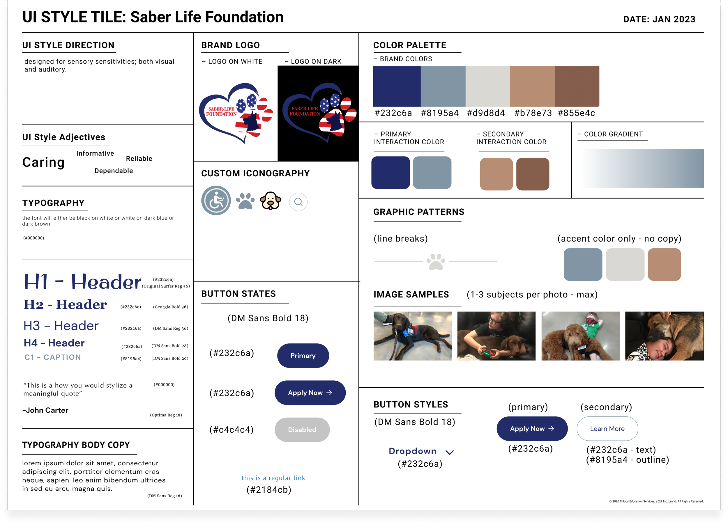
Style tile
A few new guidelines were laid out for the UI of the site.
Mature color pallet
Muted tones for sensory sensitive individuals
Making all motion graphics and video/sound optional
High contrast for all copy and backgrounds
Simple images
My signature move: a custom illustrated element for the site!
Early mockup with sketch of the original service dog that inspired Saber Life Foundation: Saber himself
Accessibility
This is a site dedicated to assisting people of all abilities to source a service dog for their various needs and lifestyle. It was crucial that the basic site itself passed ADA compliance before we added on the Accessibility Menu. Tim sourced Purple Lens for our purposes and I created a custom icon for Saber Life Foundation that matched the updated style of their site.
My team and I had an interesting discussion regarding the use of an accessibility menu. I would like to summarize our findings here to address this evolving topic:
UX/UI designer perspective
My design mentor advises strongly against them, saying that they interfere with the accessibility tools an individual will already be utilizing across their devices.
Web developer perspective
Accessibility tools streamline the site building process
Client perspective
Motivated to stay ADA compliant for their customers’ sake
Final Product
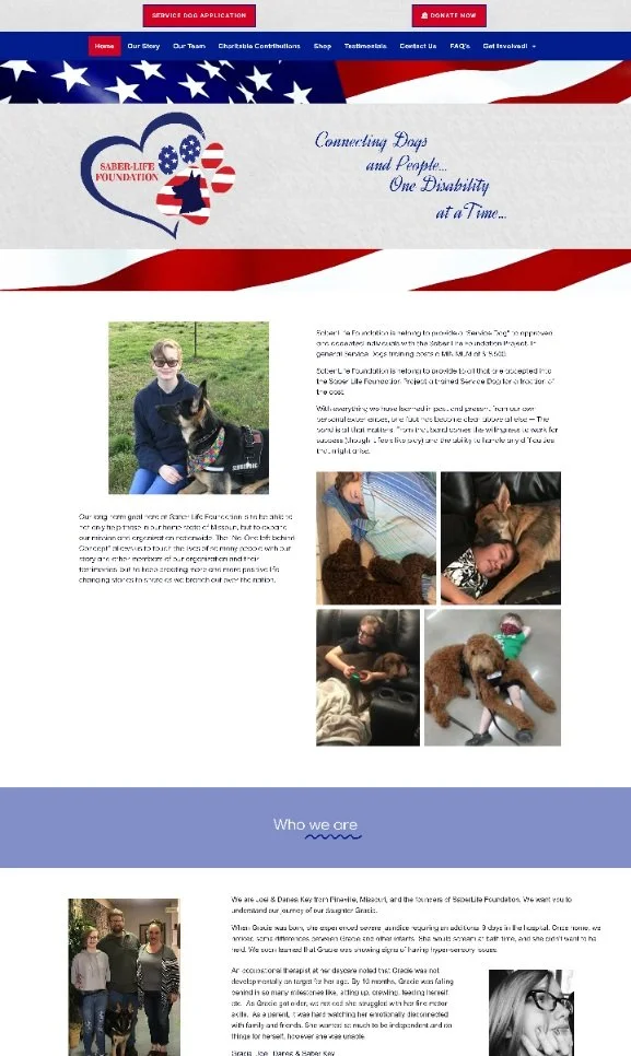
Saber Life - Before
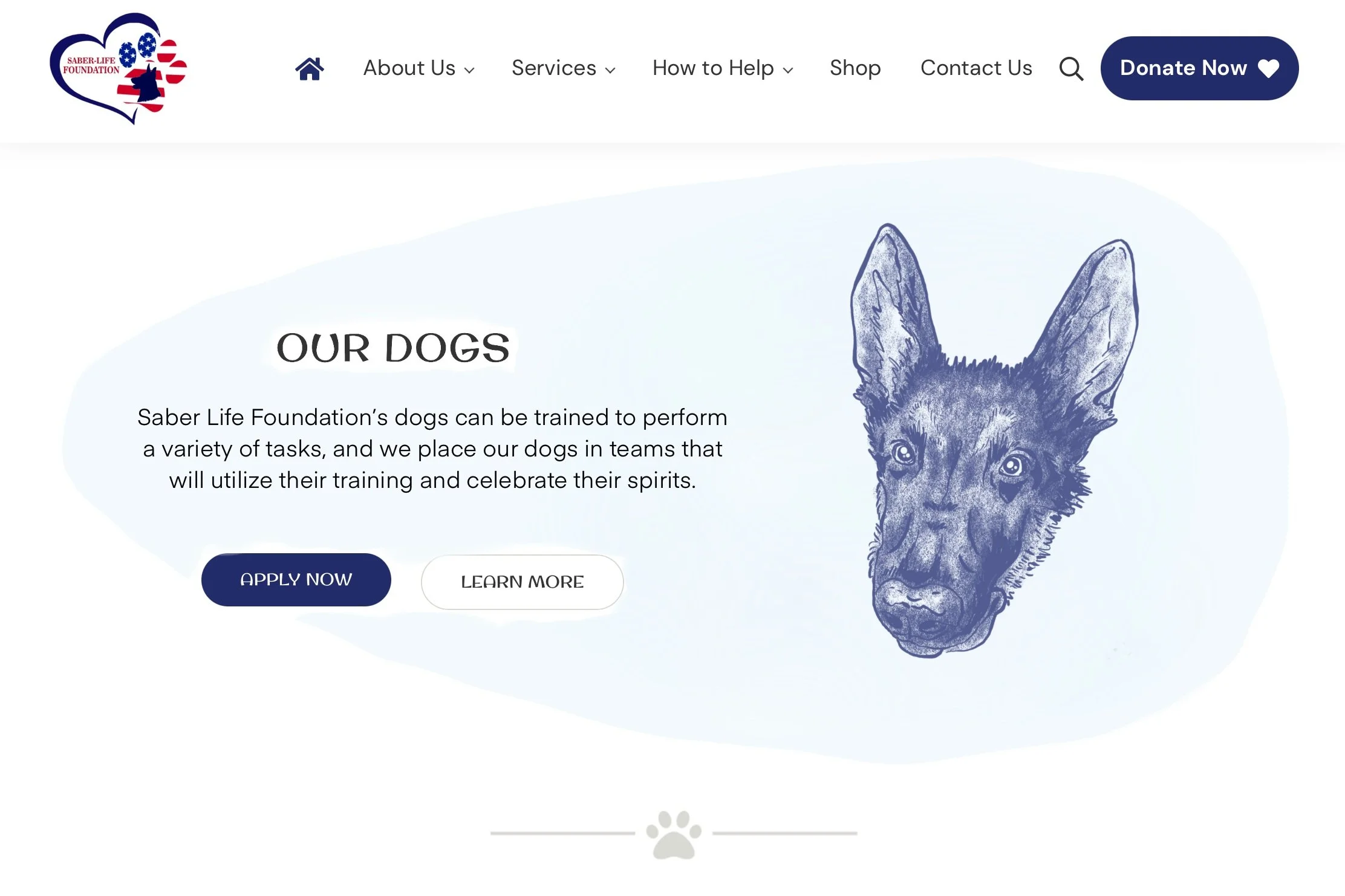
Saber Life - After
In Summary
We achieved the redesign we set out to accomplish!
Client is thrilled with their site redesign. Tim is currently coaching them on how to navigate the Google Ads Grants process. I am personally pleased to have this on my portfolio and am eager to assist other NGOs that require assistance. I learned a lot more about accessibility and the politics surrounding ADA compliance. Tim and I are looking into becoming ADA certified as a web designer/developer team.
THANK YOU!
You read through through the entire case study!
If you’d like to work with Tim and I, please reach out!


